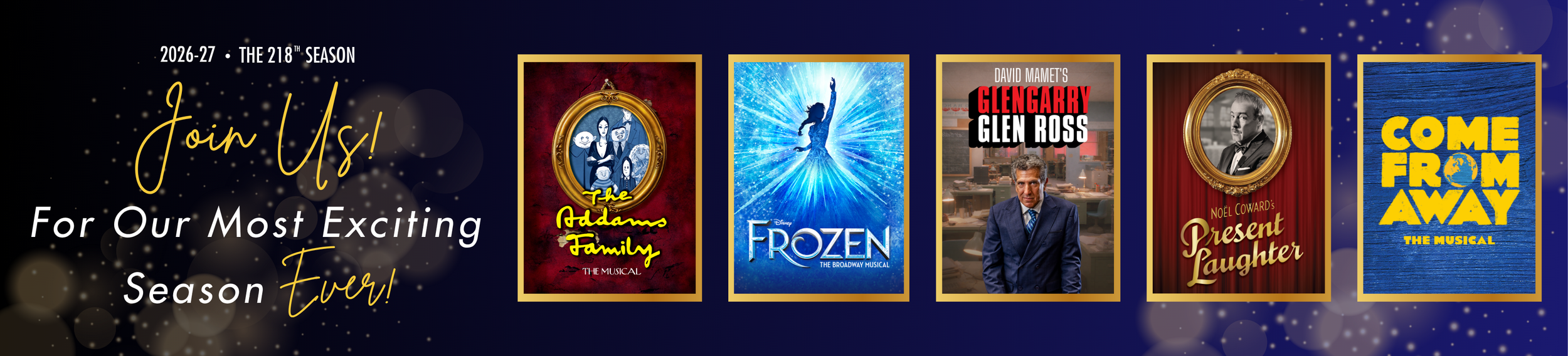
A Season Designed
Walnut Street Theatre’s 218th season visual identity translates the institution’s long-standing theatrical legacy into a cohesive, contemporary design system. Centered on the idea of performance as transformation, the concept embraces a season positioned as the most exciting yet—a celebration of powerful storytelling, gold accents, and moments of glittering theatricality. The system balances structure and adaptability, giving each production its own voice while maintaining a unified seasonal framework.
A refined typographic system, restrained color palette, and production-inspired graphic language create a flexible identity that works across genres and applications, from key art to digital and environmental design. The result is a modern visual expression of a historic theatre, designed to evolve with each act of the season.
Here’s a breakdown of how the aesthetic for the 218th season was developed.
The Season
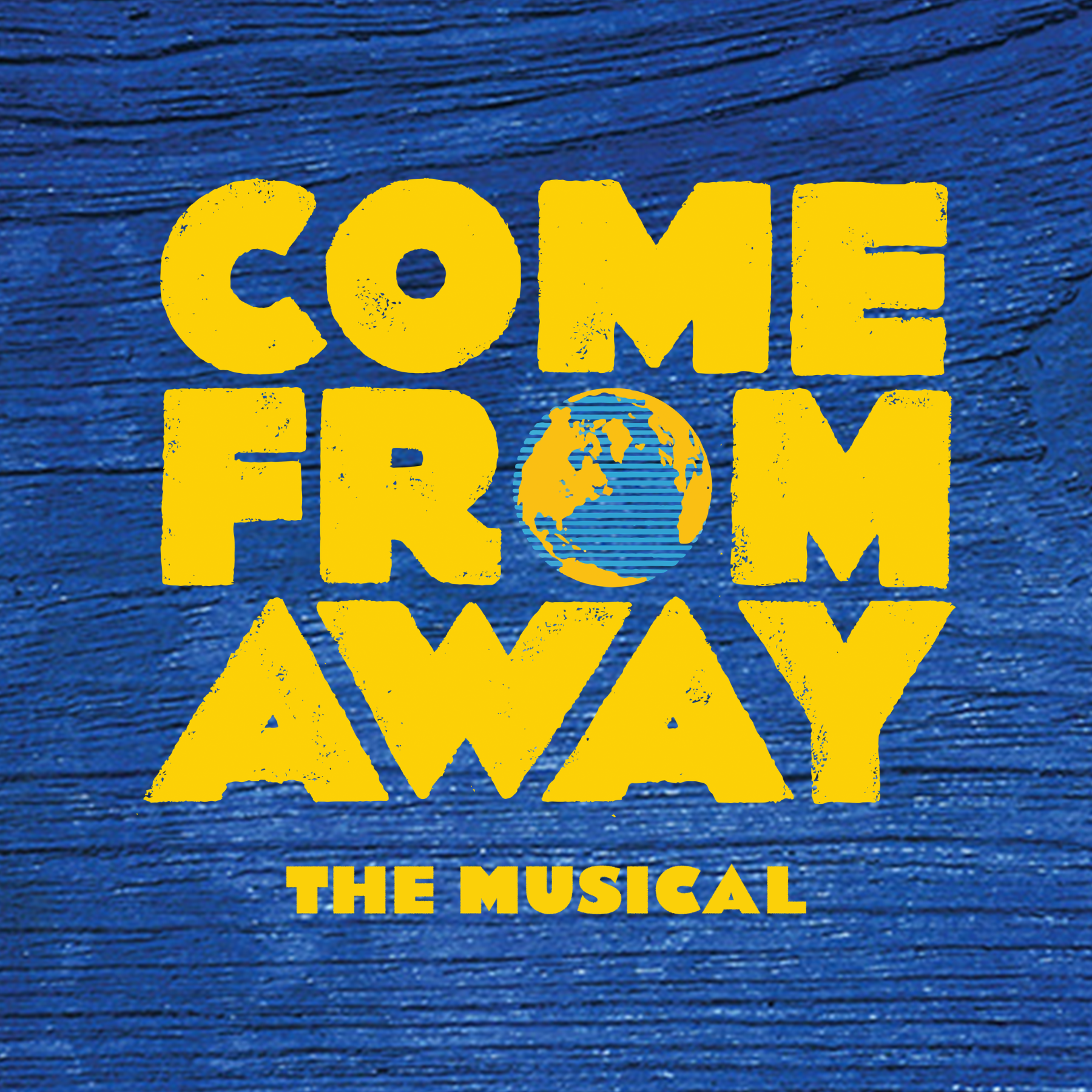
The 218th season celebrates the power of storytelling through an extraordinary lineup of classics and new works.
The theme—the most exciting season ever—celebrates a legacy of powerful storytelling, glamour, and impact while looking boldly toward the future.

The Core Idea
The Most Exciting Season Ever.
Theatre excites and celebrates—characters, stories, and us.
The identity captures that energy with gold, light, and movement in a system that shines on stage.





Creative Direction

CELEBRATORY
Contemporary design that feels current, confident, and forward-looking.

TIMELESS
Rooted in tradition with a nod to the grand heritage of Walnut Street Theatre.

BOLD + MODERN
Contemporary design that feels current, confident, and forward-looking.
Typeography System
A refined script adds elegance and expressive flair, while clean sans-serif typefaces provide clarity, structure, and modern balance.



Color + Material Language
The color palette is intentionally restrained, anchored by deep, rich tones.
Gold acts as an accent—used strategically to create moments of emphasis and theatricality.
Beyond color, materiality was important. The identity incorporates a sense of texture and light—evoking metallic surfaces and shimmer.






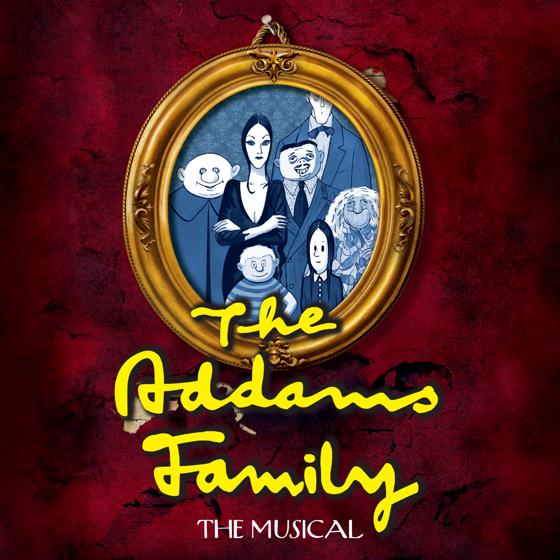
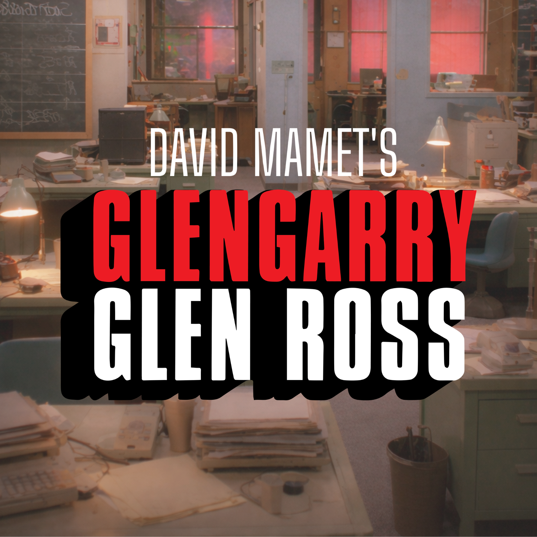
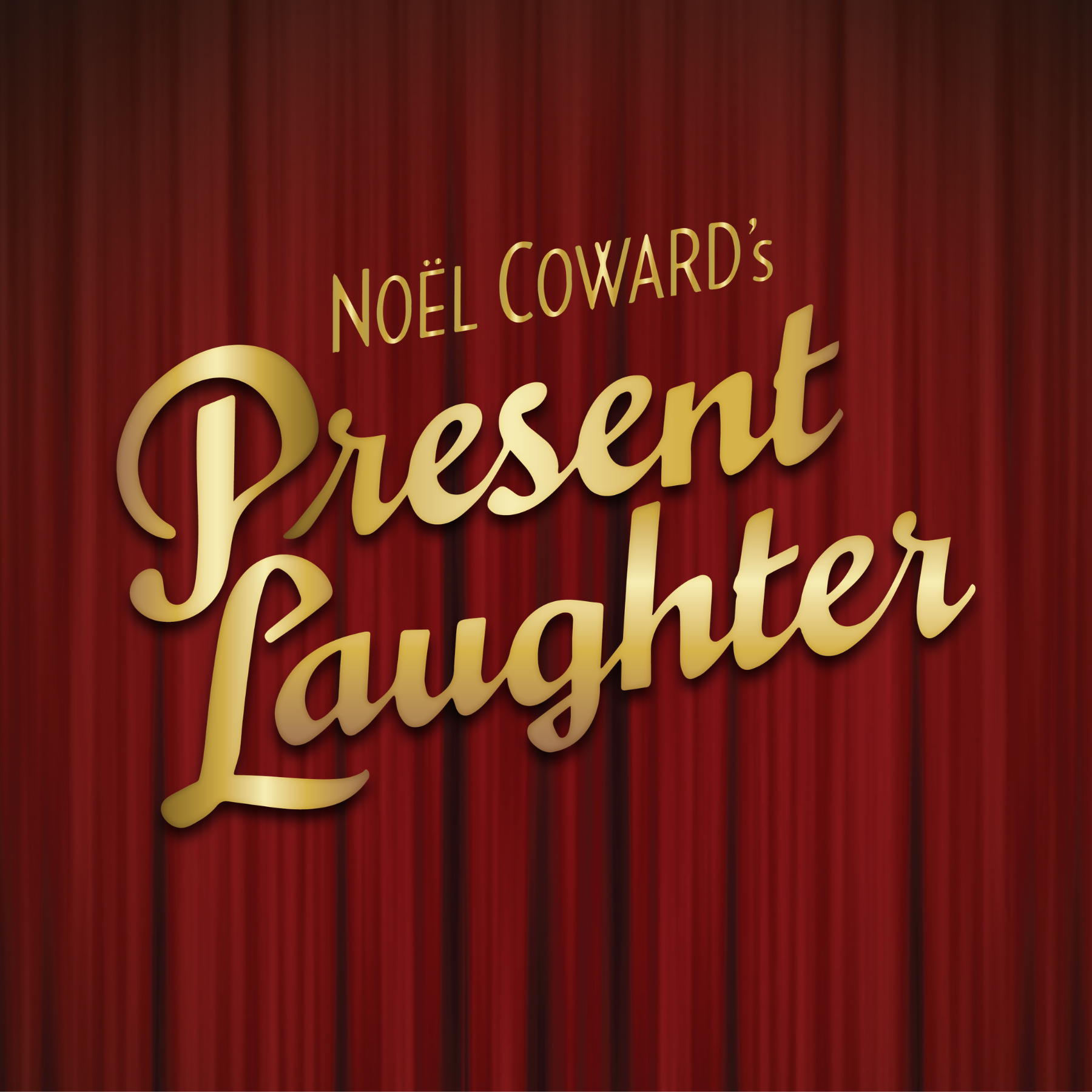
Key Art System
Each production has its own voice within a unified visual framework, while maintaining a consistent seasonal identity that ties the entire body of work together.